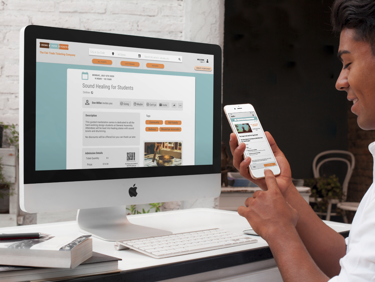
Brown Paper Ticket
Responsive Design - Mobile + Desktop
A Fair Trade Ticketing Company
Brown Paper Tickets is a grass-roots Seattle based company offering a fair trade business model for event hosting on their platform. Hosts are able to create and list events on this platform for a very minimal fee only taken with ticket sales. This site was created for event hosts and anyone who enjoys attending events or is interested in supporting events that insure the creators are receiving majority of the sales directly with very little cut from the middle man.
Tools
Figma, Miro, InVision
Year
July 2020
Applied Techniques
Surveying, User interviews, Usability testing, Affinity Mapping, Persona, Mood Board, User Flow, Lo + Hi Fidelity Wire-framing, Prototyping
The Challenge
Brown Paper Tickets can be accessed through two separately addressed sites, depending on the type of experience you would like to have - mobile or desktop. We discovered on the homepage and throughout there were several different flows that would guide you to pages that did not offer intuitive naming conventions.
Desktop
Mobile
Proposed Solution
Create one responsive site experience for both mobile and desk top.
Simply naming conventions
Remove unnecessary access hyperlinks or pathways on the home page
Streamline the user experience for ticket purchasing checking out
Visually improve the experience with less options through the event hosting flow
We discovered through that there were two types of users - one that was creating and hosting an event, the other. We jumped right in to see if we would need to explore identifying multiple types of users.
The Research
Our team navigated the deep waters of research in sync.
Developing a screener survey, each of us set up interviews where we measured qualitative and quantitative responses to the physical survey and through usability testing of the site. Through this process we were able to measure behavioral responses as well.
Through comparative competitive research, I discovered a few surprising outcomes:
The checkout flow for purchasing retail is that the checkout flow was rather smooth.
Our competitors all offered an option for purchasing ready made drinks for pick up at different locations.
Repetitive Navigation throughout the site isn’t abnormal
Thou Mayest had the clean, straight-forward aesthetic
Synthesis
The process of affinity mapping was one of the most delightful aspects of this project - it played a strong part in our introduction to our Persona, Don.
User Research I Persona
Our team quickly understood there were two different types of users. We also recognized that based off of our interviews, the type of person to use the site for purchasing could be the same individual who would host an event.
A host + event creator
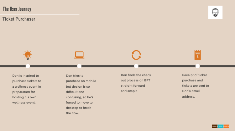
Ticket Purchaser
This led us to the decision to create one persona and our friend throughout the journey, Don Miller.
The Plan
The Navigation System
With Don’s help, we were able to recognize that the user flow through the site was confusing and required a little bit more thought than he would have liked.
To improve the overall experience for Don, we reorganized the hierarchy of the main navigation and reorganized where some content lived into other categories. The list shared below was our initial draft and our referral as we moved through the process.
User Flow + Iterations
A light redesign based on the original user flow for an event check out
Divide and conquer
We recognized that because our user had two different ways to use the site, we needed to redesign the experience from both perspectives. From our research we found that while users most often used the desktop version to create events, they used mobile to browse and purchase events. So, our team divided to design these two experiences for the user - on desktop (David and myself) and mobile (Sugandh and Frank).
We began to sketch some initial ideas as a team through zoom. After we agreed collaborated on the initial design sketches, we began the first iteration in Figma.
Color + Type
Our goal here was not to move too far away from the grassroots vibe of this local ticketing company. A lot of the charm came from their branding choices. We decided to stay within the same color family and bring the tune and tone of the colors into something a little bit easier to reach and digest the content and options available on the site.
The Design
Iterations on Desktop
After creating our initial design for desktop we were able to run usability tests. In the feedback we received these are the changes that we intend to make:
Remove the drop shadow from buttons
Remove the “Tags” section as such a big part of the screen. Make it minimally impactful in the process of creating the event.
Allow the uploaded image to take up more space. Let it help tell the story. “Maybe overlay some text over the imagery”.
Learnings + Take Aways
In a team project, the most important thing is to formulate a plan. All of us discussed goals, strategy and objectives for the next 15 days. There were two key points which we agreed with:
Time Boxing - We wanted to create a time box around any issue. Hence, if there was a disagreement then there was a time parameter of 15 minutes for discussion. From there, we set a time box of 30 minutes to arrive at a solution. This way, all problems were to be addressed in a desired time frame. This also allowed us to function and be more productive through the day. Anything beyond 45 minutes was not worth the time. We dropped the issue and noted it to revisit it later.
Groupthink - We also supported the idea to eliminate “Groupthink” (the practice of thinking or making decisions as a group in a way that discourages creativity or individual responsibility). As we were collaborating, we encouraged each other to discuss the problem. However, at the end of the day, the majority ruled during a disagreement.
Apart from the above two, there were other revelations.
We achieved a shared goal which met our deadline in an effective manner.
Listening to your teammates and being patient with them.
Respect each other’s pace of work and space because everyone is different.
Shared workload can increase the productivity at higher levels.
Taking everyone’s ideas on board and not just your own can create amazing designs.
Encouraging and caring for each other can result in building stronger relationships.
Any battle can be won when you work and stand together.


